Author Topic: GUI changes for v3.0  (Read 1233327 times)

Zak

  • Global Moderator
  • Sr. Member
  • *****
  • Posts: 2450
By default for new users, the left navigator will not be enabled and navigation will be done via the tabs which i will discuss in a later post or read the other discussion topic where its covered.
I know this is a very early discussion, but based on this and the second mockup you seem to lose a lot of drag 'n drop functions. A lot of tasks can be done so easily now because everything is displayed simultaneously, side by side.

At a glance:

* Dragging tracks into a playlist
* Dragging tracks from Inbox to Library (and presumably other nodes I don't use like Audiobooks, Podcasts etc.)
Bee excellent to each other...

redwing

  • Guest
By default for new users, the left navigator will not be enabled and navigation will be done via the tabs which i will discuss in a later post or read the other discussion topic where its covered.
I know this is a very early discussion, but based on this and the second mockup you seem to lose a lot of drag 'n drop functions. A lot of tasks can be done so easily now because everything is displayed simultaneously, side by side.

At a glance:

* Dragging tracks into a playlist
* Dragging tracks from Inbox to Library (and presumably other nodes I don't use like Audiobooks, Podcasts etc.)

Won't be a big deal.

- Use, instead, right-click> send to command (even to a specific playlist/folder) just as is currently available (playlist folders should show playlists in it)
- For a frequently used nodes like music or inbox, could be dragged to a tab header on the top
- Like iTunes, it could be implemented that starting dragging immediately pops up hidden left navigator with playlist/computer folders/devices nodes available (maybe staying for a second or two on a folder need to open up its content to help navigating into a deep-lying folder or playlist)

Steven

  • Administrator
  • Sr. Member
  • *****
  • Posts: 34312
@zak, you will be able to drag tracks to tabs, and for playlists, the list of playlists + the library and inbox nodes will display in the left panel where "Artists v" is in the screenshot so you can easily drag from the library/inbox to any playlist. I agree most power users are going to enable the left sidebar with the navigator but i just think many users wont need it.

Zak

  • Global Moderator
  • Sr. Member
  • *****
  • Posts: 2450
I missed it earlier, so I only just read through the other redesign thread which has started a lively discussion of new ideas. It also makes clear the left-hand navigator panel isn't going away. :)

To start with this is a very quick mockup of how the panel layout will be configured. Elements can be re-arranged in order top-to-bottom


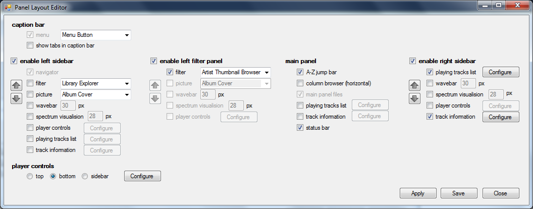
I don't see that dialog box making things easier (for users or programmer) and it breaks a lot of UI rules along the way.

* Everything is a checkbox. If in future you add another screen element, you have to add another checkbox (or two) and resize the form to accommodate it. Add another feature - add another checkbox, and so on... It simply isn't scalable.
* Presumably the arrows are to reorder the top-to-bottom order of elements, but how would they work? Buttons shouldn't be reordering other form controls.
* Having four columns might replicate the view of the panels on the screen, but it doubles up everything on the left and right sides.
   -  This image is over 1000 pixels wide, which is a big dialog to show on a laptop displaying 1366.
   -  If choosing one side disables the other it's a bit weird to show both
   -  What if I want a wavebar shown on both the left and right sides? This screen implies it should be possible to do so - until I start clicking.
   -  Why can I show a picture on the left but not on the right?
*  There are lots of Configure buttons leading to sub-sub-dialogs, which is just burying options further down in the interface again.
   -  Configure buttons for some sub-dialogs are shown twice which is confusing.
* It includes options for the location of the menu and tabs. I guess tabs are a part of the main "panel", but I think the menu is outside this area and these options have only a tenuous connection with what the rest of the screen is trying to achieve.

A lot of the complexity in MusicBee's configuration now is due to the gradual inclusion or rearranging of features over time. There are currently 16 tabs in the Preferences dialog, most of which have a dozen or more controls and many of which include buttons that open further sub-dialogs with dozens of controls. This mockup is just heading down that same path again and not taking advantage of the opportunity to fully reassess how things are done.

Bed time now, but I'll post suggested improvements later in the week.
Bee excellent to each other...

Steven

  • Administrator
  • Sr. Member
  • *****
  • Posts: 34312
The screenshot isnt actually how the settings will be implemented.
Its intended to visually and quickly convey that the musicbee GUI will be split into a number of sections, each section will be configurable with a set of sub-panels allowed and the sub-panels can be re-arranged and many of the sub-panels can be configured.
As to how its implemented i have a couple of ideas that broadly described would be:
1. section headers on the left; sub-panels on the right; drag a sub-panel into the left and place in the desired section. Configuration settings show for the selected sub-panel as a list in a bottom panel
2. similar to the screenshot, but vertically oriented so it fits into the existing Layout(1) preferences; with settings either as a list in a panel on the bottom (as in 1), or alternatively expanding in place when a sub-panel is enabled
Other suggestions welcome

SimonBRT

  • Sr. Member
  • ****
  • Posts: 434
I've sadly been away from these forums for a while and wow!  Lots of catching up to do, but some fantastic discussion and excellent ideas coming through.  The mockups all look great, and I am really interested in an approach that is less reliant on the left navigator panel.  Permanently pinned tabs for things like Library/Now Playing is how I have used MB for years.  The exception being a tab to select playlists for which I always have the left navigator displayed.  Interested to see how these may potentially be handled.  Exciting times ahead...

P.S. Massive Excel geek for years and I've grown to bloody love the ribbon - don't hate me...   :-\

mikebo

  • Sr. Member
  • ****
  • Posts: 350
BTW I'd like to see two added layout features from 3.0 though I don't know it's planned or even possible.
- drag & drop of each panel/element to change its location

That's what i was thinking too. A truly modular interface, which lets you drag and drop elements like now playing list, lyrics, player controls etc.
There could be one button or menu item called 'Customize' or 'Lock/Unlock panels' or something, that would enable a mode in which you could rearrange things and change each panel's settings.
That's roughly how it could look like with unlocked panels

 
Each panel would have a gear icon or some other icon giving you access to the panel's settings, and all the draggable panels would have a doted pattern by which they could be dragged. Panels could be stacked in a sidebar or combined with other panels in a tabbed panel (i don't know if this sentence makes sense, but it's late and i will leave it for you guys to figure out :))

Steven

  • Administrator
  • Sr. Member
  • *****
  • Posts: 34312
1. section headers on the left; sub-panels on the right; drag a sub-panel into the left and place in the desired section. Configuration settings show for the selected sub-panel as a list in a bottom panel
There are too many configuration options for some of the elements to realistically include them in the same dialog. Elements can be dragged between the various panels with some restrictions


Zak

  • Global Moderator
  • Sr. Member
  • *****
  • Posts: 2450
That screenshot looks much friendlier.  :) Thanks for clearing that up.

There are too many configuration options for some of the elements to realistically include them in the same dialog.

I think if some of the options were moved from dialog boxes to context menus in the main interface it could still work.
Bee excellent to each other...

redwing

  • Guest


That looks horrible. Even an experienced user would need quite a time to figure out what to drag to where, not to mention new users.
Again, do not offer false choices, which only makes things look unnecessarily complicated. For instance, top & bottom pane is only for player bar, but how could a new user figure it out before trying to drag every other element to there? Is there another location available for navigator, library explorer and column browser to drag them to somewhere else?
I would give only on/off option for those elements, and four options for player bar.
And then below them, list now playing list, track info, pictures, wave bar and spectrum visualizer in the center to be dragged either to left or right when enabled.

psychoadept

  • Global Moderator
  • Sr. Member
  • *****
  • Posts: 10691
I like the drag & drop concept, but redwing has a point.  It seems like you could solve the problem with visual cues, though.  A red x for areas that the element can't go in, a green check (or just a ghost version showing up) for elements that it can.  Users would figure it out pretty quickly.

Also, maybe there should be separate elements for each kind of picture, for those who like to see both artist and album art, for instance.

(A really wild thought that I had is what if the configuration screen were basically a mini version of the program screen, with simple shapes for each element that you could move around?  I figure that would be pretty complicated, though.)
Last Edit: February 10, 2015, 04:54:29 AM by psychoadept
MusicBee Wiki
Use & improve MusicBee's documentation!

Latest beta patch (3.5)
(Unzip and overwrite existing program files)

mikebo

  • Sr. Member
  • ****
  • Posts: 350
I think the mockup i posted earlier solves the problem of complex configuration windows. I've highlighted the important elements in case you missed it :)

Steven

  • Administrator
  • Sr. Member
  • *****
  • Posts: 34312
I like the drag & drop concept, but redwing has a point.  It seems like you could solve the problem with visual cues, though.
exactly - and some non-blocking information message when the user does something not supported to lead them in the right direction.

Again, do not offer false choices, which only makes things look unnecessarily complicated. For instance, top & bottom pane is only for player bar, but how could a new user figure it out before trying to drag every other element to there? Is there another location available for navigator, library explorer and column browser to drag them to somewhere else?
I would give only on/off option for those elements, and four options for player bar.
The library explorer, column browser, and thumbnail browser can be docked in the left navigator or the left main panel. You can also have for example the library explorer in the left sidebar and the thumbnail browser in the left main panel.
I will however make a couple of changes to the mockup for items that can only exist in one panel

I have no intention of supporting drag/drop of panels in the player itself because (a) its something you rarely do and (b) any visual cues that comes with it is just getting in the way for the vast amount of time using the application and (c) a way would be needed to introduce new elements not already shown in the application window
Last Edit: February 10, 2015, 09:29:56 AM by Steven

Steven

  • Administrator
  • Sr. Member
  • *****
  • Posts: 34312
I think if some of the options were moved from dialog boxes to context menus in the main interface it could still work.
yes thats what i plan to do eg. clicking Configure on the track information element opens a dialog to configure that element. Its the same dialog that would be opened if you right click/ Configure Panel in the application itself

redwing

  • Guest
The library explorer, column browser, and thumbnail browser can be docked in the left navigator or the left main panel. You can also have for example the library explorer in the left sidebar and the thumbnail browser in the left main panel.

Then would it be possible, from v3.0, to have library explorer on the right side of thumbnail browser, or column browser on the right side of thumbnail browser? If not, their places are pretty much pre-determined depending on what combination of elements are enabled, aren't they? That's why I called them false choices that would just make configuration a daunting job.
And I don't like introducing the new term of "left main panel". I know what you mean and the visual differences between that and left sidebar. But we can just take it as the natural result of displaying selected enabled elements, without over-complicating things (the complexity comes mainly from that the panel can be a left-most or a second left bar depending on the existence of navigator and that the user have to choose either one for configuration).

I have no intention of supporting drag/drop of panels in the player itself because (a) its something you rarely do and (b) any visual cues that comes with it is just getting in the way for the vast amount of time using the application and (c) a way would be needed to introduce new elements not already shown in the application window

Those visual cues could be only enabled by a right-click menu "Unlock" (along with "Hide" command). It would make it unbelievably easy to move panels and elements around (like moving wave bar from the bottom of the left sidebar to the top of right sidebar), and the users won't need to open layout editor frequently except when they want to introduce new elements. Please think about it again.