Show Posts

This section allows you to view all posts made by this member. Note that you can only see posts made in areas you currently have access to.


Messages - 9cupsoftea

Pages: 1 2 34 5 ... 10
31
Beyond MusicBee / Re: Happy New Year!
« on: January 01, 2014, 04:34:08 PM »
Happy new year!

32
MusicBee Wishlist / Re: Plugin Repository as Calibre
« on: October 31, 2013, 10:26:49 PM »
+1

33
MusicBee Wishlist / Re: Sync button
« on: October 31, 2013, 04:59:45 PM »
At the moment each device has its own sync button, which is why I think there is not
one 'global' sync button in the main interface.

So how would a global button work if you had two or three devices attached?
Would it pop-up a dialogue so you could choose the devices to sync?
Would it give you an opportunity to check/change the sync settings (Eg. which playlist(s) to use?)


A pop-up dialogue would be fine if Steven wants to account for those cases. You can already set it to have dialogues to pop up when you sync (deleting files, overwriting files, that kind of thing).

34
MusicBee Wishlist / Re: Sync button
« on: October 30, 2013, 05:38:23 PM »
i would be willing to add a hotkey so you can add a toolbar button but why not just set 'automatically sync when the device is connected'

I have a sansa clip which charges off usb. Sometimes I'd just like to plug it in to charge and take it out without worrying about my playlist changing. Often I leave it plugged in overnight, and in the morning would like to make changes to the playlist and sync before I take it out.

There are also occasions I'll grab music from my work computer or a friends, and I don't want to risk it being deleted immediately upon insertion. We also have a spare clip that I use for storing demos I've made which I wouldn't like to be deleted.

Granted, I might be a fringe case, but still, thanks a lot for the addition. With such a small-memory player it's extremely useful.

35
MusicBee Wishlist / Sync button
« on: October 29, 2013, 10:56:56 PM »
I mentioned this a while ago I think but it was in a topic about something else. I think it would be really efficient to have a sync button appear when a device connected.

Alternatively, adding a sync option to the already extensive list of toolbar button options would be just as good. It would save me the fiddly trouble of opening a tab, choosing my player from the sidebar, clicking sync, then closing the tab constantly (as the tab doesn't remain for my device when I close it).

36
MusicBee Wishlist / Re: Podcast handling improvements
« on: October 28, 2013, 07:27:46 PM »
This is perfect!

37
MusicBee Wishlist / Re: Podcast handling improvements
« on: October 26, 2013, 03:29:49 PM »
this should address the scrollbar issue and the artwork drill-down issue:
http://www.mediafire.com/?w3gh8o0zcyj8faa

Thanks. I don't seem to have the issue anymore.

38
MusicBee Wishlist / Re: Podcast handling improvements
« on: October 26, 2013, 11:00:19 AM »
I have an issue since applying this update where, when using artist view, when I drill down into album and tracks view I see this:

edit:
image removed to reduce clutter

39
MusicBee Wishlist / Re: Podcast handling improvements
« on: October 24, 2013, 04:05:06 PM »
i took out podcast directory because i didnt think people would actually be using it - am i wrong about that?

it wasnt intentional that the subscription list follows the track browser orientation so i will fix that.
I guess vertical orientation will work better for people with widescreens so it should be configurable

I would definitely like a search function, but only if it works well. The previous (current?) one was really clunky, and most of the podcasts I listen to weren't listed. I think the search function needs to be both comprehensive, and make it easy to subscribe to listed feeds (to take out the fuss of finding and copy pasting weird rss urls). If that can't be done effectively, though, it's probably better to just leave it out.

As I mentioned before though, rhythmbox for ubuntu has a great search function. Somehow they can search the itunes store, which is without doubt the biggest directory, and if they can do it, I'm sure it could be implemented into musicbee.

40
MusicBee Wishlist / Re: Podcast handling improvements
« on: October 24, 2013, 06:39:37 AM »
Subscription panel seems to be following the track browser panel orientation

Surely those should be separated?

I would even argue that a horizontal layout in podcasts is unnecessary.

+1
I agree. Scrolling space seems a lot more useful for the list-like nature than sideways space in this instance.

41
Since this sort of thing has been done with the compact player, I thought it might be nice to implement it with the main player also. Itunes sort of does this when sorting by albums like in the examples below. It would be a neat visual touch to use when drilling down into albums from the artist artwork view.

Multiple albums (and thus colours) could maybe be handled with some kind of fading, or even bordered colours.


42
Icons / Re: Countries Flags
« on: October 21, 2013, 07:41:36 PM »
Rather than being flag specific, a more general implementation of matching images to tag values would meet the OP's request and allow for other uses too.

Random examples:

* icons to distinguish between albums and singles
* icons for occasion (party hat for "Party", Cake for "Birthday", Christmas tree for "Christmas", pumpkin for "Halloween" etc.)
* a little frowny face for low bitrate files


I just realised it might not be as difficult to implement this as I first thought. It just requires an update to the existing Highlighting feature to allow for images as well as colours.

+1
This is a brilliant idea, allowing for all kinds of creative ways to highlight different groups of tracks with images.
+1 I'd really like this too, and can think of more than a few ways I would use it.

43
MusicBee Wishlist / Re: Podcast handling improvements
« on: October 12, 2013, 04:19:42 PM »
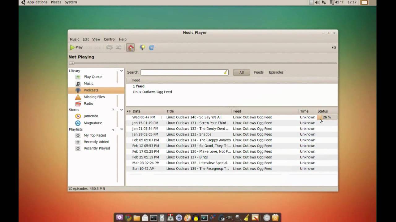
Sorry to bump this old topic, but I've recently had to use Ubuntu at work and discovered, surprisingly, that rhythmbox (the default player) has exactly the kind of podcast handling that would be perfect for musicbee. It's a pretty basic music player otherwise, and nowhere near as good to use as MB, but this is one area I think Musicbee could take some design cues from.


This is exactly how I suggested podcasts be displayed in an above post, as I think it shows more information, and allows far quicker and easier navigation and playing of podcasts. There's a list of feeds, and below it, a list of podcasts for each feeds with info on what is downloaded, dates, and podcast titles.


Adding podcasts is really easy: You click add, type in an rss url or just some search terms, and are presented with relevant results that have pictures and even descriptions. I have no idea how rhythmbox manages to do this, but it works really well, and as it is open source (linux only, though) I imagine it wouldn't be too hard to figure out.

I'm not sure about syncing from rhythmbox as I sync only from my home computer, but if Steven is still open to improving the podcast handling I would still strongly suggest a 'mark as listened' option upon sync. Again, sorry to bump this old topic, but I just thought this would clarify further some of my earlier suggestions.

44
MusicBee Wishlist / Re: Podcast handling improvements
« on: September 17, 2013, 10:28:05 PM »
I don't know if it's just me being stupid but for some reason setting the podcasts displayed to 0 doesn't work for me. I save the setting but it just doesn't seem to catch for some reason.

I should have explained a little better what I meant by showing episode title. A lot of podcast managers have similar settings to musicbee by default (such as itunes) but they get away with it through being customisable and other such things (itunes detects synced and played podcasts, removing a lot of the need to check episodes constantly).

Just to clarify, here's some things other podcast managers do that I think are a bit cleaner:


Gpodder (and others like juice) put the podcasts on the side, and show the downloaded episodes with a bit more space and information in the main panel. This would probably make musicbee's left panel a bit too cluttered, but a separate panel within the podcasts section would probably work. Perhaps horizontally like the radio stations panel, or another column.


Itunes (and I think songbird) has a nice album art-like view for podcasts that I think would be more consistent with Musicbee's other views. The larger space to click on in order to drill down is a lot easier than the tiny collapsing arrows. It also looks a lot more colourful and modern.

Another option could be to simply have a column in the podcast view that shows current episode date and title. Then you could turn all drag and drop or 'sync to' behaviour for the podcast title to act like the latest episode (I hope that sentence makes sense).

Incidentally, I've also noticed that double-clicking podcast title brings up an error, when I expected it would play the latest episode (I had to double-click the episode itself to play it).

45
MusicBee Wishlist / Re: Podcast handling improvements
« on: September 16, 2013, 11:06:54 PM »
My mistake - I assumed 'episode date' was the date of the latest episode.

Here's an image with that I mean by 'episode' and 'podcast' title:


Pages: 1 2 34 5 ... 10