Author Topic: New Album Auto-Tagger layout?  (Read 3707 times)

silasje1

  • Member
  • Sr. Member
  • *****
  • Posts: 652
Hey folks..

did some photoshop to make the Album Auto Tagger look better and be more funtional


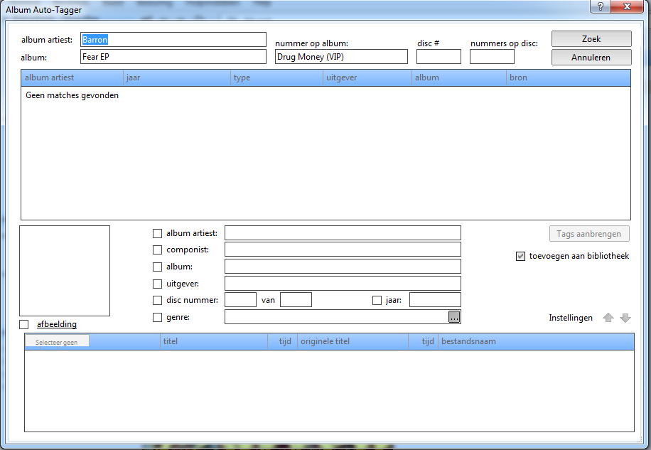
What i have changed:

-Swapped the Cancel and Search Buttons (looks more natural!!)
-Removed lines of text like: search (which is quite logical when you see it, so removing it makes more room for other things)
-Made the Album Search higher
-Made the Track list a bit smaller
-Settings button and the up down button were moved up too
-Removed some more useless space and lines to use the complete screen alot better!
Last Edit: May 20, 2012, 07:03:18 PM by Silas Arentsen (Silasje1)
HDMI GTX570->YAMAHA RX-V471->DALI ZENSOR 1

Dutch Translation

WMP 12 Skin

KoffieBo0N

  • Guest
Looks way better! Hope this improvement will be added  ;D.

silasje1

  • Member
  • Sr. Member
  • *****
  • Posts: 652
Looks way better! Hope this improvement will be added  ;D.

So do i!!!

Edit:
I added a new descrition to describe what i have changed :)
HDMI GTX570->YAMAHA RX-V471->DALI ZENSOR 1

Dutch Translation

WMP 12 Skin

Steven

  • Administrator
  • Sr. Member
  • *****
  • Posts: 34349
i doubt KoffieBo0N can do anything about it!
i have made some changes along the lines suggested

silasje1

  • Member
  • Sr. Member
  • *****
  • Posts: 652
i doubt KoffieBo0N can do anything about it!
i have made some changes along the lines suggested

 ;D

Thanks anyways.. The screen was just too clutterd here. But im eagerd to see the improvments!
HDMI GTX570->YAMAHA RX-V471->DALI ZENSOR 1

Dutch Translation

WMP 12 Skin