Author Topic: GUI changes for v3.0  (Read 1253491 times)

sleepless

  • Sr. Member
  • ****
  • Posts: 287
-In the 'Now Playing' panel, I'd like the 'track information' option to display the information from the 'track information' settings, instead of the fixed fields displayed currently.

it was intentional in order to keep the height minimal so the visualiser bar lines up in certain configurations. If i was to make it configurable, it would be its own configuration but not promising that
Makes sense.
-In the 'Now Playing' settings, I think the 'show track information' option should not be listed under the 'playing tracks' heading. It is a separate element and this doesn't make sense, imo.

not sure i understand what you are looking to acheive with that
I just saw it as an organizational issue. I don't think settings for one element (track information) should be listed under the header of a different/separate element (playing tracks). No biggie though.

hiccup

  • Sr. Member
  • ****
  • Posts: 7890
As a new user, I found all the "Now Playing" options to be confusing. I feel that "Now playing" should be used to describe the view/panel listed in the navigation panel only. The tab in the 'Preferences' list needs a name change ("Playback"?) and the 'now playing list' should be called 'playing tracks list', as should any other header/description for the 'playing tracks list' element.

The matter of possible improvements on descriptions, and getting them a little bit more consistent, both within MusicBee, and also for the purpose of explaining the workings of MusicBee in the forum and tutorials has come up a few times before.
There have been quite a few suggestions for some changes already, but they are scattered around several threads by now, and have not had much focus on.
I believe I suggested something like 'Playing queue' for the current Now Playing', but there have also been suggestions on improving wordings or descriptions for concepts such as 'Library' and 'Auto-organise'.

If and when Steven is open to such suggestions for some changes, it would probably be good if a dedicated topic would be opened for that single purpose.

Bee-liever

  • Member
  • Sr. Member
  • *****
  • Posts: 3837
  • MB Version: 3.6.8878 P
- How about replacing "Panel Settings" with an (gear-shaped) icon and removing "No Settings"? That would make things quite less complicated.
not sure about this one - can you do a mockup? I am imagining it wouldnt look very good. I like the balance the current way has but equally i agree "No Settings" and a ... button isnt ideal.

Looking at this, I think you are right Steven.  One of those ideas that sound good but when you look at the visuals - it doesn't work.
Maybe just removing the "No Settings" box on those items would work?


also the new Controls.DropAreaIndicator override could match the highlight when you click Settings and are taken to the Preferences panel
MusicBee and my library - Making bee-utiful music together

redwing

  • Guest
- How about replacing "Panel Settings" with an (gear-shaped) icon and removing "No Settings"? That would make things quite less complicated.
not sure about this one - can you do a mockup? I am imagining it wouldnt look very good. I like the balance the current way has but equally i agree "No Settings" and a ... button isnt ideal.

I had something like this on my mind.


settra

  • Newbie
  • *
  • Posts: 16
i just installed on a touch screen the version 3!
1) for some reason, if i open any "Settings" window in musicBee, that initially does not fit in my screen (my scren is vertical, with higer Dpi than normal), then there is no way, to see the part of the window that did not fit initially in the screen.. (this was also in V2.5), making it almost impossible to use settings... am i doing something wrong?

2) the touch scrolling in artist view works, but its not smooth at all.  any plans on fixin this ? :P

redwing

  • Guest
To give as less as options to users, "stack" tickbox could show up only when needed.
The screenshot above shows the tickbox for left main panel where ticking does nothing.
Also, when only two elements are listed under a panel, ticking one element should force tick the other too, vice versa for unticking, since ticking only one element means nothing.

<Added>
The wording for the second option of stack "ticked elements are stacked on top of each other and viewable by clicking a selector button" is not clear (especially "stacked on top of each other" which could sound vertically stacked). Maybe it could be just "ticked elements are viewable by clicking a selector button on the panel header".
Last Edit: January 25, 2016, 09:21:16 AM by redwing

ankor

  • Jr. Member
  • **
  • Posts: 106
i figured out how to stop the flashing which is done for the next v3 update
You never give up ;-)

Serious talent!!

ankor

  • Jr. Member
  • **
  • Posts: 106
-I feel the "playing tracks", as an element, should be called "playing tracks list" -it's just less confusing in my opinion. It is called 'now playing list' in [Preferences>Now Playing], (settings for this element are located here) and I think it should be called 'playing tracks list' here as well, for the sake of consistancy. Also in the 'elements' list in [Preferences>Panels Configuration] it should be called 'playing tracks list. I just feel consistancy in naming is important for learning and ease of navigation.
yes i agree

The verbiage should be whatever is informative but I believe it's very important (especially for new users) for labels to match and be consistent. If not, it can be difficult at times to know if you're in the right spot or not.

redwing

  • Guest
With "highlight playing track in the main panel" option enabled, if you switch from Tracks or Album &Tracks view to Album Cover or Artists View, the main panel doesn't highlight playing track unlike v2.5.

hiccup

  • Sr. Member
  • ****
  • Posts: 7890
How about aiming for more of a WYSIWYG configuration panel:


edit,

I removed the 'stack' check-boxes in anticipation they might replaced by a 'joint' indicator and more advanced configuration settings elsewhere.
Last Edit: January 25, 2016, 01:47:00 PM by hiccup

MeeMeeMee

  • Full Member
  • ***
  • Posts: 235
Since the matter of confusing options is discussed here, there's something that bugged me for ages in the settings and I've been working around it. Sure, I could've experimented a bit and figured it out but I didn't want to mess about. It's the artwork storage settings. Here's what's unclear to me:
MusicBee 3.5.8516 / Windows 10 (64-bit) / Intel i5-3470 / 8GB RAM
Media on NAS (CIFS share)
20K+ tracks, predominantly FLAC ; converted to mp3 (lame -V 0) when synced to a Cowon D2+
________________________________________________________________________________________________
Get the latest patch: https://getmusicbee.com/patches/

HHM

  • Sr. Member
  • ****
  • Posts: 389
Dunno of it's a bug or intentional behavior:
in Now Playing tab I cannot edit files tags (sfift + mp3 EDIT: of course I meant shift+enter).
So when I am in this mode (and with MB3 I am there frequently as it looks very nice) and need to edit tags, I need to find a playlist containing the particular track. Quite inconvenient.

I'd suggest adding this functionality + adding the option to edit tag by a doubleclick on a related tag field in column view (when you're in Now Playing tab + Playlist mode). I'd also be happy if the Playing Tracks (Now Playing tab, Right Sidebar, track details layout) fields were editable (right now there are only artwork, artist and title fields), so that it would be easier f.e. rate tracks from the album without switching any views or tabs (just by having Rating field visible in the Playing Tracks column). It would also be consistent with the regular MB's Playing Tracks options, in which you can set any tag field to be displayed.
Last Edit: January 26, 2016, 02:32:34 AM by HHM

hiccup

  • Sr. Member
  • ****
  • Posts: 7890
And perhaps we could loose the 'stack' check boxes.

An option could be that if you drag an element on top of an existing element (instead of above or below it), it could get stacked with that element, displaying some 'joint' indicator:
 

Joolee

  • Newbie
  • *
  • Posts: 17
Some things I noticed:
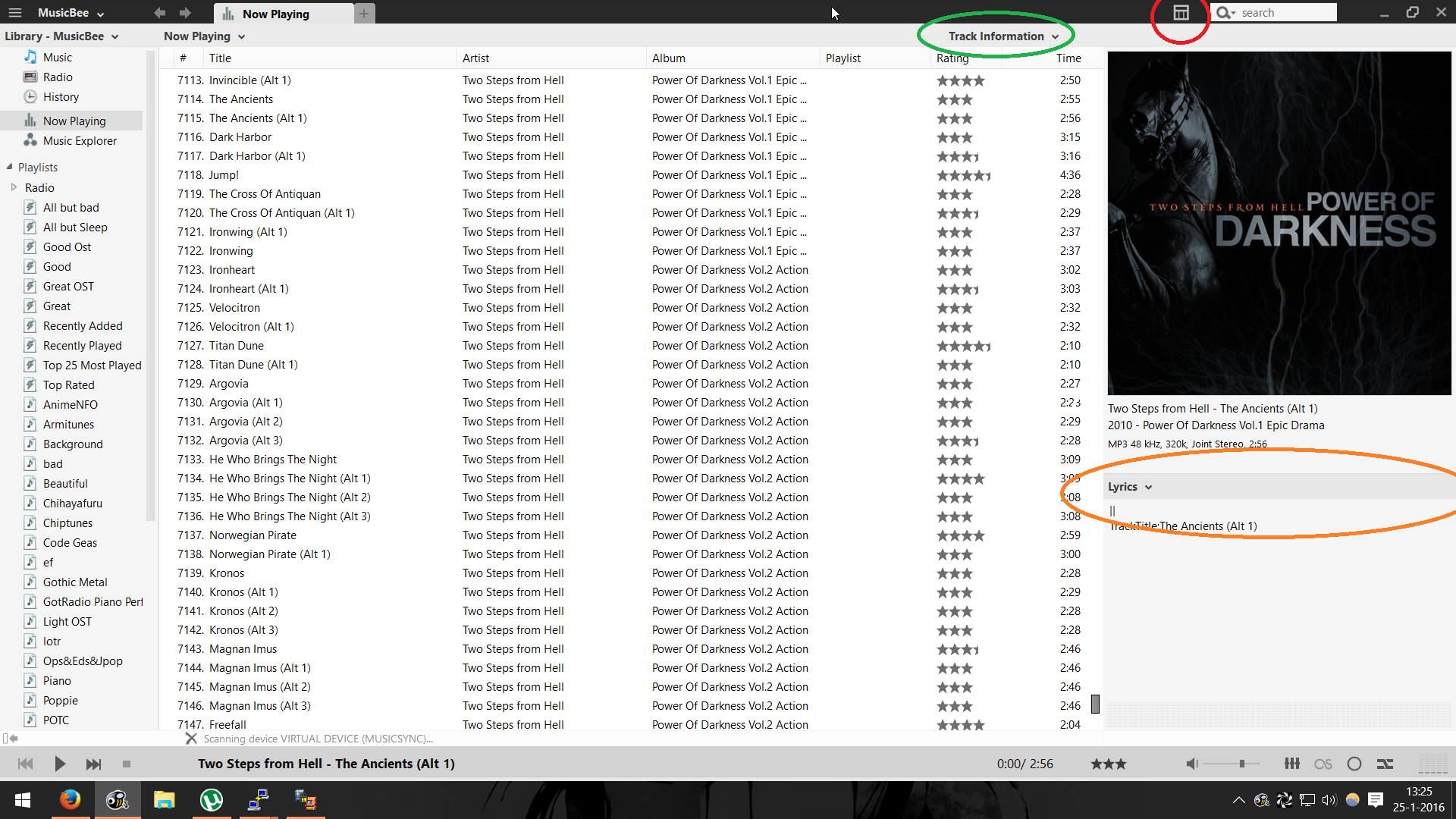
 - Why is the green encircled item there and not to the right, above the panel it refers to?
 - What is the difference between the green and the red items? They both refer to the same panel but link to different setting windows. Can't the red button be integrated in the submenu of the green item?
 - In the "Dark-Metro" skins at least, the red button has a little arrow to the right, indicating you get a submenu when you click on it. It links directly to a settings window though.
 - Can the "track information" panel be made to resize automagically so the Lyrics window always gets the most possible screen estate? (orange)
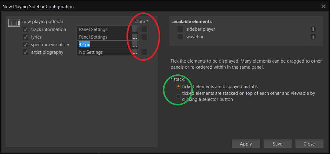
 - The changing cursor to indicate you can resize the right sidebar is very unstable. You can click to resize over an area of about 10 pixels but the cursor only seems to change for a single pixel and most of the times, it doesn't change at all when I hover slowly over the area. Clicking to resize always changes the cursor though.


The "Stack" tickboxes (red) don't seem to get saved. Also, I don't really understand the green settings, but that might be because I can't test it.


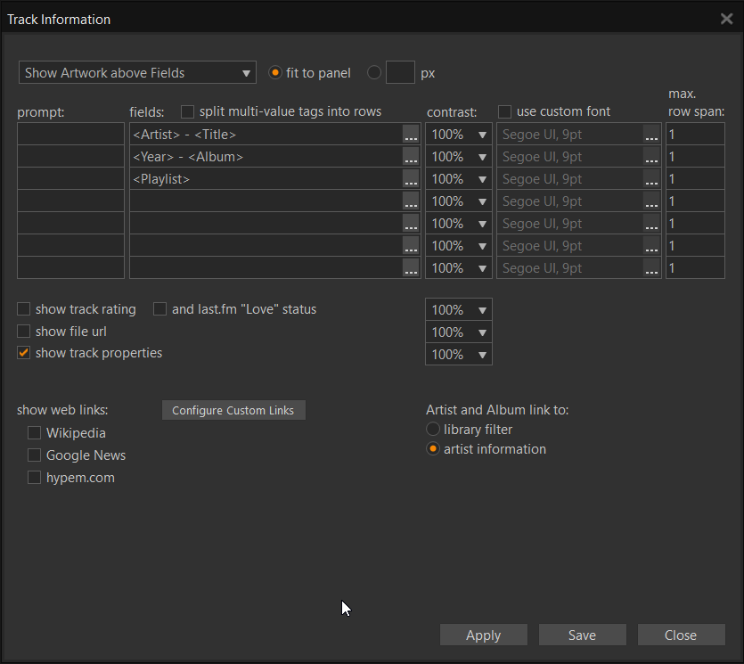
The settings below do get saved but applying them is not consistent. Sometimes a change applies immediately, sometimes when changing track, sometimes I have to restart MusicBee to apply the changes.


//Edit:
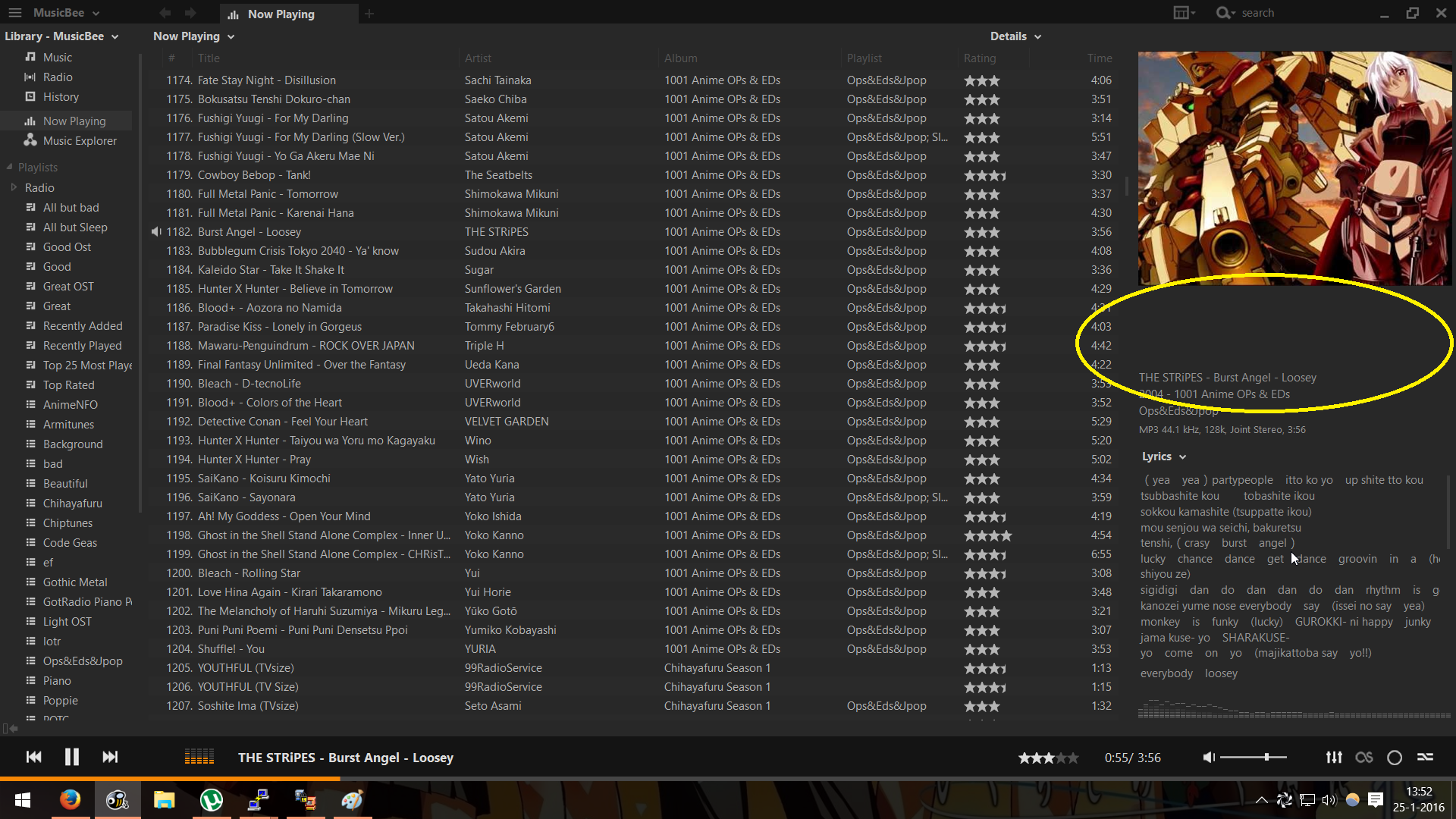
Below an example where auto resizing of the track information would be welcome

Last Edit: January 25, 2016, 12:54:56 PM by Joolee

Alumni

  • Sr. Member
  • ****
  • Posts: 1007
How about aiming for more of a WYSIWYG configuration panel:

Interesting idea. Personally I don't think the panel in its current state needs a complete overhaul, if anything just a few minor tweaks.