I missed it earlier, so I only just read through the other redesign thread which has started a lively discussion of new ideas. It also makes clear the left-hand navigator panel isn't going away.

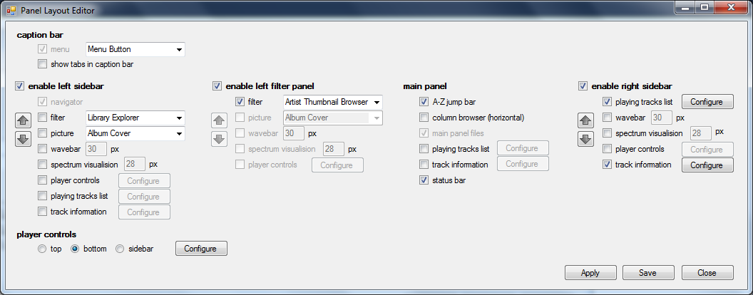
To start with this is a very quick mockup of how the panel layout will be configured. Elements can be re-arranged in order top-to-bottom

I don't see that dialog box making things easier (for users or programmer) and it breaks a lot of UI rules along the way.
* Everything is a checkbox. If in future you add another screen element, you have to add another checkbox (or two) and resize the form to accommodate it. Add another feature - add another checkbox, and so on... It simply isn't scalable.
* Presumably the arrows are to reorder the top-to-bottom order of elements, but how would they work? Buttons shouldn't be reordering other form controls.
* Having four columns might replicate the view of the panels on the screen, but it doubles up everything on the left and right sides.
- This image is over 1000 pixels wide, which is a big dialog to show on a laptop displaying 1366.
- If choosing one side disables the other it's a bit weird to show both
- What if I want a wavebar shown on both the left and right sides? This screen implies it should be possible to do so - until I start clicking.
- Why can I show a picture on the left but not on the right?
* There are lots of Configure buttons leading to sub-sub-dialogs, which is just burying options further down in the interface again.
- Configure buttons for some sub-dialogs are shown twice which is confusing.
* It includes options for the location of the menu and tabs. I guess tabs are a part of the main "panel", but I think the menu is outside this area and these options have only a tenuous connection with what the rest of the screen is trying to achieve.
A lot of the complexity in MusicBee's configuration now is due to the gradual inclusion or rearranging of features over time. There are currently 16 tabs in the Preferences dialog, most of which have a dozen or more controls and many of which include buttons that open further sub-dialogs with dozens of controls. This mockup is just heading down that same path again and not taking advantage of the opportunity to fully reassess how things are done.
Bed time now, but I'll post suggested improvements later in the week.